Applications
NTA Dashboard
The dashboard is a self-contained application that runs directly in your web browser. There is nothing to install. You simply open the file and load your NTA data.
What it does
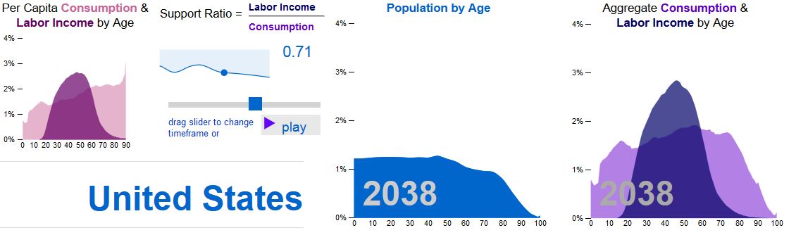
At its core, the dashboard lets you visualize and explore NTA estimates interactively — age profiles, cohort profiles (for those with NTA for several years), timing measures, demographic indicators, and forward projections. Charts and tables can be exported for use in reports and presentations.
How you use it will depend on where your team is in the NTA process.
For teams building or updating accounts, the dashboard is a diagnostic tool. Plotting age profiles and cohort trajectories as you work makes it easier to spot estimates that look implausible, identify inconsistencies across variables or years, and assess whether revisions are moving in the right direction. Visual inspection of this kind is hard to do efficiently in a spreadsheet. Your estimates can be compared with those for other countries by including NTA estimates for other countries.
For teams with established accounts, the dashboard supports further analysis. Timing measures summarize the age distribution of each variable as a single statistic and track how it changes over time. The indicators page computes the support ratio and first demographic dividend. The projections page combines NTA profiles with population projections — for example from the UN World Population Prospects — to produce aggregate estimates through future decades.
Adapting the dashboard
The dashboard is a single HTML file, which means it is straightforward to modify. Teams that want to adjust the layout, add variables, or change how results are displayed can do so. One avenue worth mentioning: the file can be uploaded directly into an AI assistant such as Claude and modified through conversation — describing what you want in plain language and iterating from there. This is not a requirement, but it is a practical option, and it fits with a broader aim of bringing AI tools more directly into NTA research workflows.
The dashboard is released under a Creative Commons Attribution 4.0 license. Data displayed are drawn from country-specific NTA studies, and users should acknowledge the original data creators in any publication or report.
NTA Data Explorer
Sample data
These data can be downloaded so that they can be imported into the app.
US NTA data 1990 to 2024 estimates by Lee and Donehower
US Pop Projections UN WPP 2024 projections for the US
Interactive consumption and labor income
The interactive data explorer is a new tool for understanding how changes in population age structure are influencing patterns of consumption and production. Historical estimates and projections for 40 countries are provided.
Visualizing population age structure and the economy
Interactive Data Explorer
A Generation Perspective on Flows to Uses: NTA Sankey Charts

The NTA Sankey Charts, created by Ricardo Cantu, illustrate the flows from resources to uses, from a generational perspective. Select two countries and compare their similarities and differences.
NTA Country Summaries
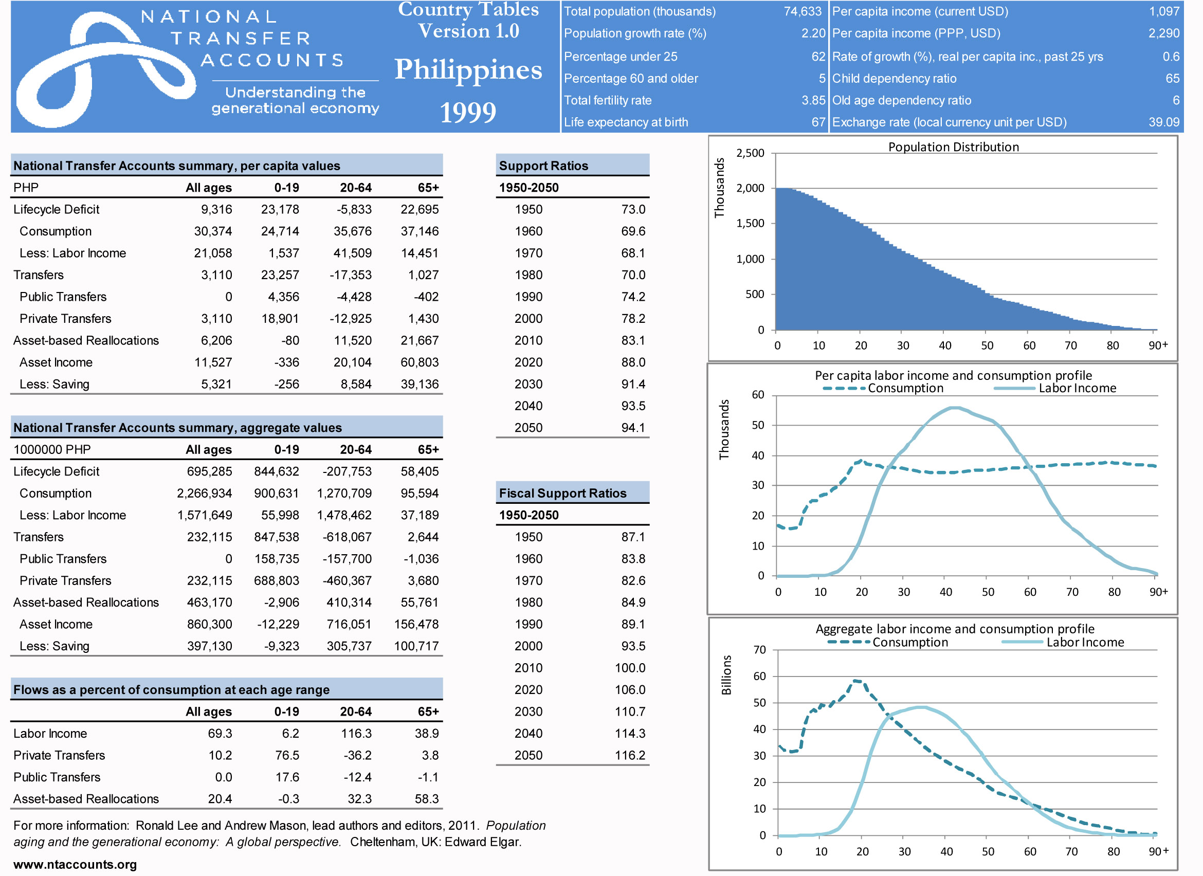
| Country Summaries, available for selected NTA countries, provide summary information and more detailed Country Tables. More extensive and up-to-date information are available in the database (see the main menu). |
Funding consumption: A dynamic look at the lifecycle
Michael Abrigo (Philippines) animates how consumption is financed at different stages of the lifecycle. He provides separate estimates for countries at different stages of economic development.
Download static version